Impact of Mobile-Responsive Design on Manufacturing Websites
Manish Kumawat
Last Updated on: 06 October 2025
Let’s imagine: you're showcasing your fantastic manufacturing business to a prospective customer, but instead of an elegant workplace, they have to make their way through a disorganized factory. Is it a pretty sight? Definitely Not! That is equal to a non-mobile-friendly website.
Are you feeling or thinking any of the following?
- Why does my manufacturing company website look bad on my phone
- How to get a responsive manufacturer website
- The manufacturing website looks good but is not good on mobile phone
Then, the following information is specially written for you! Here we see the impact of mobile-responsive design on manufacturing Websites and how it can take you to the top of the manufacturing industry, Alos We are trying to answer this query how do I get a responsive manufacturing website for my business? .
What does mean by Mobile-Friendly Manufacturing Website Design?
A manufacturing website design that is optimized for mobile devices simply means that your website is designed to function properly on smartphones, the little computers that we all carry around. The truth is that an increasing number of individuals these days use their phones to explore the internet, including looking up manufacturers similar to yours. For all those prospective buyers, putting a large "CLOSED" sign on your online storefront is the same as having a non-mobile-friendly website.
Here's what makes a website mobile-friendly:
- Mobile-Friendly Design
- Clear and Easy Navigation
- Quick loading times
- Easily navigable buttons and links
- Fewer words, greater impact Large,
- Stunning pictures
how to get a responsive manufacturers website
See this fact:
- 62% of websites with the highest rankings are dominated by mobile optimization.
- Almost 90% of websites use responsive design.
- Website Conversion Rates Are 11% Higher on Responsive Designs
- The Main Reason for Website Redesign is Poor Responsive Design
- Non-responsive design of a website is the cause of visitors leaving in 73.1% of cases.
When statistics are inspiring you, why do you need more proof?
Impact of Mobile-Responsive Web Design on Manufacturing Websites

These days, everyone's completely attached to their phones. Potential clients, engineers, and even distributors are browsing the web, researching manufacturers, and requesting quotes – all on those little screens. So, if your manufacturing website isn't built to work flawlessly on smartphones and tablets, it's like having that complex staircase – you're shutting out a huge chunk of your audience before they even get a chance to see what you're all about.
Making Connections on the Go
Image: in the absence of the internet, when you want to meet your client from abroad, you have plenty of challenges like the visa process, travel expenses, and soon. The specialty of the internet is that it allows people to connect from anywhere, anytime. An engineer on a remote site might need to check your capabilities for a specific project, or a potential client on their morning commute could be browsing machine shops in their area. A mobile-responsive website ensures they can access all your crucial information – from services offered to past projects – easily and instantly, right on their phones. It's like having a virtual, mobile-friendly version of your showroom, accessible 24/7, wherever your audience might be.
First Impressions Matter, Especially When It Comes to Precision
Your website is your digital handshake with the world. If someone stumbles upon your website on their phone and it looks like a jumbled mess, well, their trust factor might take a nosedive faster than a dropped ball bearing. A mobile-friendly website with clear navigation, sharp images, and easy-to-read text makes a strong first impression. Imagine a potential client walking into your actual showroom – everything is clean, and organized, and the machinery gleams. That's the kind of impression you want to make online too.
It's All About Convenience
Let's be honest, no one wants to wrestle with a website. People always want things to be easy, especially on our mobile phones. A mobile-responsive website bends and flexes to fit any screen size, so whether someone's browsing on a giant tablet or a tiny phone, your website looks sharp and functions smoothly. No more zooming in and out, pinching the screen to try and read tiny text, or getting lost in a maze of menus. It's like having a bakery door that magically widens to comfortably fit everyone – convenient and frustration-free!
Search Engines Love Mobile-Friendly Sites
Ever wondered how people find websites? Search engines like Google are king when it comes to online discovery. But guess what? Google loves mobile-friendly websites! In fact, they actually rank mobile-responsive sites higher in search results. So, if someone searches for "best cake near me" and your bakery has a mobile-friendly website, you're more likely to show up at the top of the search results.
It Saves You Money
We all know budgets are important, especially for small businesses. In the olden days, you might have needed to create two separate websites – one for desktops and one for mobile. That's double the work, double the cost. Mobile-responsive design solves that problem. You create one website that works seamlessly across all devices, saving you time, money, and the headache of managing multiple sites.
Happy Customers Lead to More Sales
Lead generation is the main benefit of responsive manufacturing sites. When people can easily navigate your website, find the information they need, and maybe even order some cronuts with a few taps, they're happy campers. A mobile-friendly website creates a positive user experience, which can lead to more sales, more leads, and ultimately, more success for your business.
Building Trust Through Transparency
Potential clients need to know you can handle their projects with precision and expertise. High-quality photos and videos of your machinery, client testimonials, and even case studies of past projects work in this task. All this information, presented clearly and concisely on a mobile-friendly platform, builds trust and positions you as a reliable partner.
A leading web design company can bring this positive impact on your business.
Why is User Experience Valuable in Mobile Responsive Design?
UX is the major element that makes the difference between a website that showcases your awesomeness and one that leaves visitors frustrated.
Making Your Website Feel Like a Walk in the Park
People don't want to get lost in complex menus and submenus on their phones. A mobile-friendly website with good UX has clear and concise navigation. Think big, easy-to-tap buttons and menus that are organized logically. No tiny text or hidden features – everything should be easy to find and use, even for someone with butterfingers. Imagine navigating your actual office building. `
Fast Loading Speeds for the Impatient Bunch (Everyone):
No one likes waiting for a website to load, especially on a phone with potentially spotty reception. A website with good mobile UX is built to be lean and mean, loading super-fast so those potential clients aren't left hanging. Think about it like waiting in line at a store. If the line moves quickly, you're happy. But if you're stuck there forever, you might just abandon ship and head to the competitor across the street. The same goes for your website – a fast loading speed keeps visitors happy and engaged.
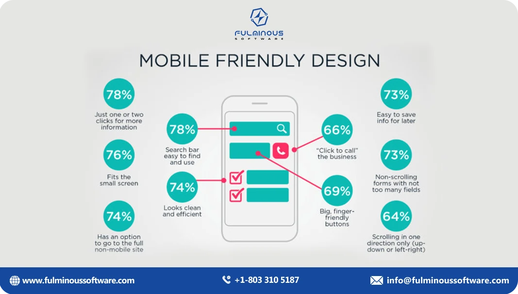
Finger-Friendly Buttons and Links:
Tiny text and buttons that require a magnifying glass are a big no-no on mobile. Everything on a mobile-friendly website with good UX should be easy to tap on with a finger, and we're not just talking about people with slender digits. Imagine that fancy app you were showing off to the investor – now it works perfectly with just your fingers! No need for extra tools, just smooth and intuitive interaction.
Minimum Text has Maximum Impact Especially on Tiny Screens:
People don't want to read novels on their phones. A mobile-friendly website with good UX uses clear, concise text that gets straight to the point. Bullet points, short paragraphs, and punchy headlines are your friends here. Think about that presentation you're giving to potential clients. You wouldn't overload them with text-heavy slides, right? You'd focus on key points and visuals to keep them engaged.
Big, Beautiful Images
Let your amazing products do the talking! High-quality images that showcase your work are essential for any website, but even more for mobile-friendly designs. People are visual creatures and stunning pictures will grab their attention on those small screens. Also, prefer suitable color schemes that make your manufacturing website visually appealing.
So, the next time you think about mobile-responsive design, remember that UX design is the magic ingredient that takes it from good to great.
Tips to Craft a Mobile-Friendly Manufacturing Website
Consider a modern production plant with shining machinery and talented workers creating fine components in today's tech-driven society, but one critical flaw: no internet access! That's the experience a manufacturer has with a non-mobile-friendly website. Here are some tips to craft a mobile-friendly website that showcases your awesomeness and turns visitors into leads:
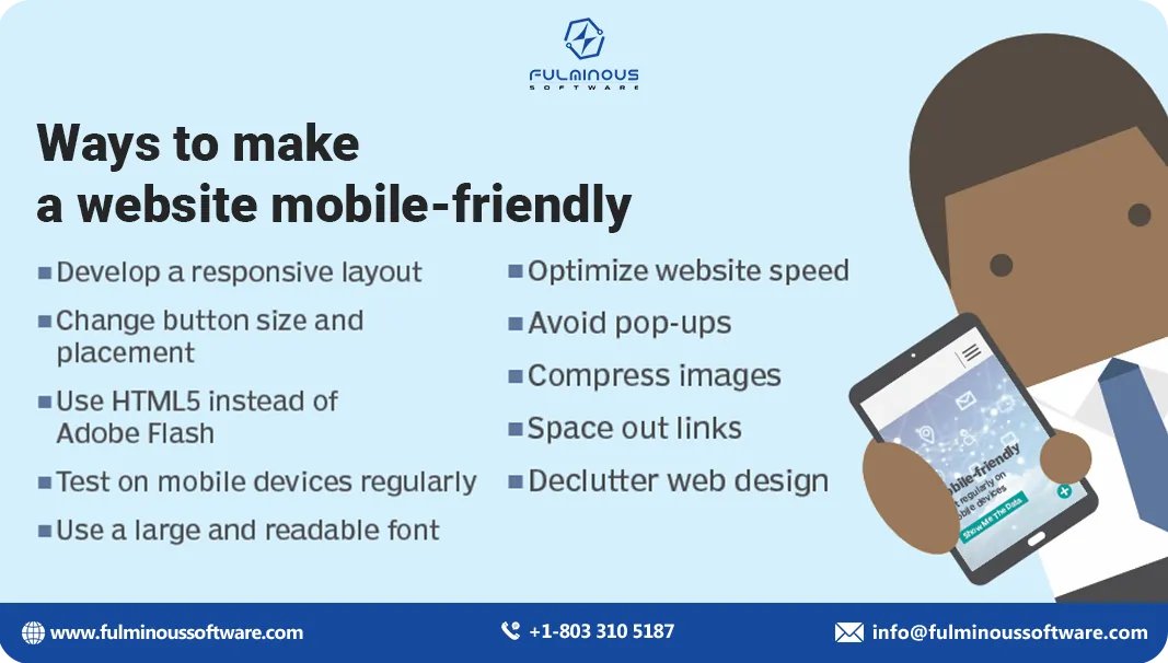
Navigation as Clear as a Blueprint (No Engineering Degree Required)
No one wants to get lost in a maze of menus on their phone. A mobile-friendly website should have clear and concise navigation that's easy to understand, even for someone who wouldn't know a gear from a sprocket. Think big, finger-friendly buttons and menus are categorized logically. Think of it like the clear signage you'd find in a well-organized factory – visitors should be able to find what they need quickly and effortlessly.
Fast Loading Speeds: The Key to Keeping Visitors Engaged
We all know the frustration of waiting for a website to load, especially on a phone with spotty reception. A mobile-friendly website should be built to be lean and mean, loading super-fast so those potential clients aren't left hanging. Think about it like a well-oiled machine – your website should run smoothly and efficiently, keeping visitors engaged and happy.
Finger-Friendly Buttons and Links: Because Stylus Pens Are So Last Season
Tiny text and buttons that require a magnifying glass are a no-go on mobile. Everything on your website, from buttons to links, should be big enough and spaced out well for easy tapping with a finger. Imagine those intricate control panels you use to operate your machinery – they're designed for precision and ease of use. Your website's buttons and links should follow the same principle.
Less Text, More Impact: Keep it Short and Sweet
People don't want to read novels on their phones. A mobile-friendly website should use clear, concise text that gets straight to the point. Bullet points, short paragraphs, and punchy headlines are your friends here. Think of it like giving a quick presentation to a potential client – you'd focus on the key points and avoid overloading them with information. The same goes for your website – keep it clear, concise, and engaging.
High-Quality Images: Showcase Your Work in All Its Glory
Let your amazing products or services do the talking! High-quality images that showcase your work are essential for any website, but even more so on mobile. People are visual creatures and stunning pictures will grab their attention on those small screens. Think about those beautiful brochures you use to promote your business – your website should be the digital equivalent, filled with high-resolution photos that capture the essence of what you do.
Never Underestimate the Power of White Space: Don't Crowd Your Visitors
While you want to showcase your amazing work, avoid cramming everything onto one page. Mobile-friendly websites should use white space effectively to create a clean and uncluttered layout. Imagine a well-organized workshop floor – there's enough space for everything, but it's not cluttered or overwhelming. The same goes for your website – use white space to create a sense of balance and make the important information stand out.
Make it Easy for Visitors to Take the Next Step
A strong call to action (CTA) is like the friendly salesperson at your trade show booth, guiding potential clients toward the next step. Do you want visitors to contact you for a quote? Request a free consultation? Make those CTAs clear, concise, and easy to find on your mobile-friendly website. Think of it like a big, friendly sign that says "Welcome! Let's talk about your project."
Test, Refine, and Repeat: Because Perfection is a Process
The best mobile-friendly websites are constantly evolving. Test your website on different devices and with different users and identify the issues. Recreate your design based on feedback and keep an eye on the latest mobile website trends. Think of it like constantly improving your manufacturing processes – it's about making sure everything is running smoothly and efficiently to achieve optimal results.
Conclusion
Your manufacturing website needs to be mobile-friendly because that's how people browse the websites these days. Imagine a website that's like a messy workshop - you wouldn't want that! A mobile-friendly website is like a clean, well-organized showroom. It's easy to navigate, loads fast, and has big buttons and clear text. Plus, beautiful pictures will showcase your amazing work and enhance your online presence. A top-notch website development company can be helpful for you in attaining this.
FAQs
- Q1: What is a mobile-responsive design?
- A: Mobile-responsive design ensures a website adapts to any screen size, providing an optimal viewing experience on smartphones, tablets, and desktops.
- Q2: Why is mobile responsiveness important for manufacturing websites?
- A: It ensures potential clients can easily access your site on any device, increasing engagement and improving first impressions.
- Q3: How does mobile responsiveness impact SEO?
- A: Google ranks mobile-responsive sites higher, improving visibility in search results and driving more traffic to your website.
- Q4: What are the key features of a mobile-responsive manufacturing website?
- A: Features include clear navigation, fast loading times, finger-friendly buttons, concise text, and high-quality images.
- Q5: How can a mobile-responsive website increase sales?
- A: A user-friendly, mobile-responsive website enhances user experience, leading to higher engagement, trust, and ultimately more sales and leads.
- Q6: Is it expensive to create a mobile-responsive website?
- A: While initial costs may vary, a mobile-responsive design saves money long-term by eliminating the need for separate desktop and mobile sites.
HIRE A TOP SOFTWARE DEVELOPMENT COMPANY
 Verified
Expert in Software & Web App Engineering
Verified
Expert in Software & Web App Engineering
I am Manish Kumawat, co-founder of Fulminous Software, a top leading customized software design and development company with a global presence in the USA, Australia, UK, and Europe. Over the last 10+ years, I am designing and developing web applications, e-commerce online stores, and software solutions custom tailored according to business industries needs. Being an experienced entrepreneur and research professional my main vision is to enlighten business owners, and worldwide audiences to provide in-depth IT sector knowledge with latest IT trends to grow businesses online.


Partner with Top-Notch Web Application Development Company!
Discuss your Custom Application Requirements on info@fulminoussoftware.com or call us on +1-903 488 7170.
15 Days Risk-Free TrialRecommended Articles