51 Best Manufacturing Website Example
Manish Kumawat
Last Updated on: 27 May 2026
In today's digital world, having an impressive manufacturing web design is crucial for showcasing your company's capabilities and attracting potential clients. Whether you're looking for service website examples or tips on website design for manufacturing companies, we've got you covered.
Top Manufacturing Website Design Examples
Explore our curated list of industrial websites that highlight exceptional industrial website development and creative website design for manufacturers. These manufacturing website design examples demonstrate how a well-crafted manufacturer can design website effectively communicate your brand's identity and services.
Why Website Design Matters for Manufacturers
A strong manufacturing company website design is more than just aesthetics—it's about functionality and user experience. Websites for manufacturers should be easy to navigate, informative, and visually appealing. By partnering with a manufacturing website design company, you can ensure your website reflects the quality of your products.
- ✔Showcase capabilities with high-quality visuals and videos
- ✔Simplify complex information through intuitive industrial web design
- ✔Generate qualified leads with strategic CTAs and forms
- ✔Build trust through certifications, case studies, and testimonials
Get Inspired by Manufacturing Website Design
Looking for manufacturing website design inspiration? Check out our favorite manufacturing website design examples to see how top companies are utilizing web design for manufacturers to stand out. From sleek layouts to interactive elements, these websites for industrial companies set the standard for excellence.
Collaborate with Experts for Manufacturer Website Design
Working with a professional manufacturing website design company can elevate your online presence. Whether you're aiming for a minimalist style or a detailed manufacturer's website, experienced designers can bring your vision to life.
Explore these top manufacturing websites design and gather ideas to enhance your own website design for manufacturing. With a top-rated website design for manufacturing company, let's make your site a key asset for your business!
Usually, we discuss the turnover of industrial firms. However, have we ever given any thought to what makes them able to accomplish all of these? Their online existence. Yes, in order to service their audience and expand globally, they absolutely need to have a fully operating website and a digital presence. Fulminous Software, as a top-rated manufacturing websites development company, will help you in achieving this milestone.
A website dedicated to offering details about a manufacturer's products and services is known as a manufacturing website. Manufacturing or industrial websites typically highlight the breadth of their manufacturing capabilities and offer technical resources, case studies, client endorsements, and other industry information. In addition, they usually offer an e-commerce platform for direct product purchases, along with contact details for any questions.
One of your best marketing tools might be a well-designed website. All industries, including the manufacturing sector, are subject to the same marketing strategies. According to a recent industrial survey, manufacturers and industrial businesses are using websites 12% more frequently this year to reach out to new consumers and customers. Every industrial website must, without overwhelming users, send a clear statement about its offerings from the outset.
Let's examine the characteristics that set apart a manufacturing website through these 51 manufacturing website design examples.
1. Pelican
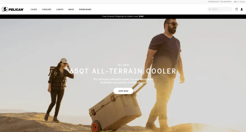
When you first visit Pelican's homepage, you'll be asked to subscribe to their email in order to get a 10% discount code. You would want to sign up because of how beautifully made this pop-up box is. You will be greeted with images of untamed landscapes and robust cargo cases if you get passed this.
You won't have any trouble understanding what the company provides because the photos are rather self-explanatory. The firm website features gray, black, and white as the primary hues to go with its products.
2. Seagate
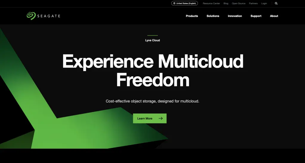
Without a doubt, you will spend a significant amount of time on the Seagate website in order to discover more about the business. The guests are drawn in like no other by the clever usage of a vivid green on a black background. The company's services and goods are all enumerated in a clear and accessible format.
Additionally, the business will ask you to complete a pop-up survey form that appears on the screen a little while after you access the website.
3. Oshkosh Corporation
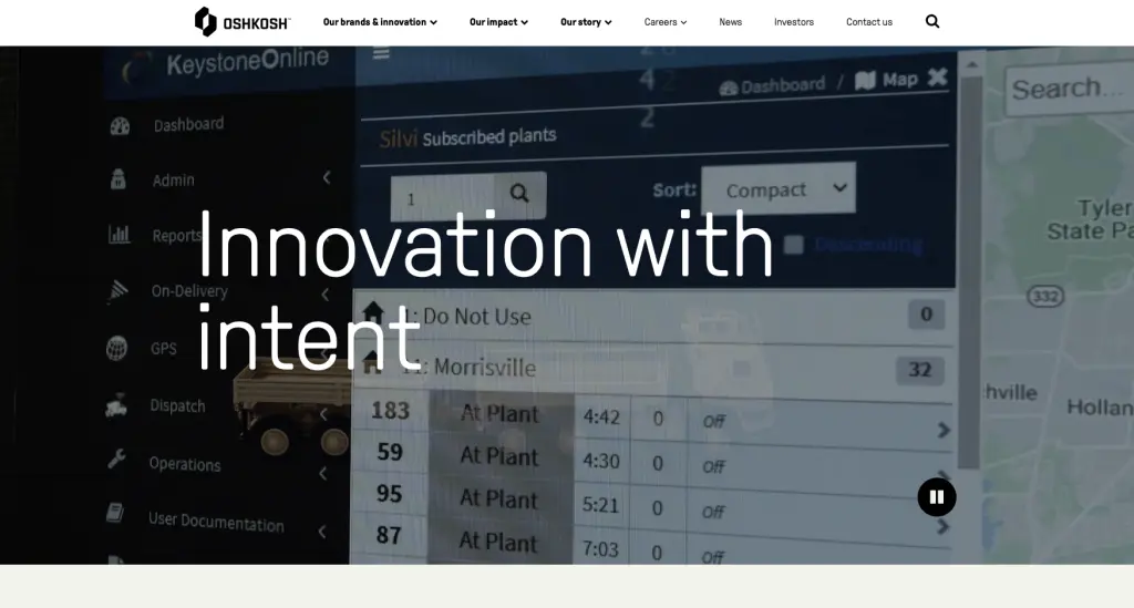
When you visit the website, you will undoubtedly be astounded by how well-organized and clean-looking the black and white combination makes it look. The website features a number of graphics that serve to grab visitors' interest.
If you go down to the bottom of the main page, you will find a section with the addresses of all the brands the website promotes. Lastly, the links to Oshkosh's social media accounts are provided at the conclusion of the page, should you like to follow the university on those networks.
4. Rice Lake Glass Manufacturing Website Examples
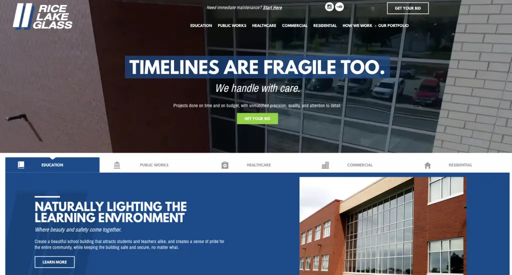
Rice Lake Glass's website has a polished and outstanding appearance. In order to provide visitors with a nice experience and encourage them to stay on the website longer, the background is white. In addition, the "Get Your Bid" tab is initially green but changes to orange when you hover over it. The visitor to the website will want to click on it because of this.
You can find the required contact details at the bottom of the page if you scroll down. You can look at their "careers" section if you'd like to work with them.
5. Graco's Manufacturing Website Examples
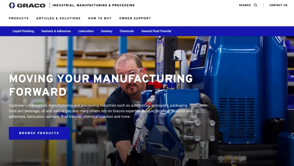
Graco's manufacturing website facilitates manufacturers' exploration of their offerings without being overwhelmed by their comprehensive worldwide website catering to a diverse array of sectors. The website provides manufacturers with easily accessible tools to maximize the value of their product offerings.
"Moving Your Manufacturing Forward" is the motto, and the manufacturing imagery immediately suggests that looking through Graco's solutions will be beneficial. Key industries supported and the most sought-after material options for processing and manufacturing are made clear in the supporting language.
6. Spray Equipment & Service Center Manufacturing Website Examples
Recently, this e-commerce website was launched by Spray Equipment & Service Center. Now completely SEO-optimized, the new website functions as a company website with an easy-to-use e-commerce platform. With material that is customer-focused and directs you to CTAs (Why Choose Spray), the homepage effectively introduces you to the company.
This manufacturing website offers user-friendly features including a live chat feature, conspicuous phone accessibility, and easy-to-use buy orders. Additionally, the homepage design facilitates product browsing and category shopping for visitors, as well as a quick exploration of Spray Equipment's more specialized services and solutions.
7. VanZeeland Manufacturing Website Examples
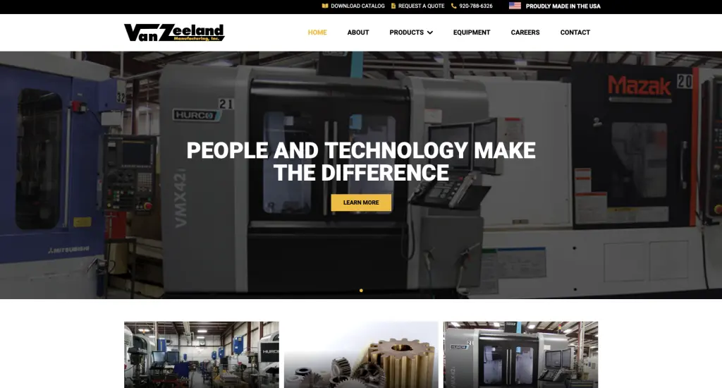
If bold and minimalist styles appeal to you, you will love this website. Because it is so striking, the black and yellow color combination manages to grab your attention. When you first visit the website, you will see a brief overview of all the services that VanZeeland Manufacturing provides.
If you want to see what gear and items the brand offers, go to the top of the page. The phone number for the company is located at the top and bottom of the page if you would like to get in touch with them.
8. FCX Manufacturing Website Examples
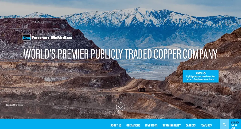
Although the FCX website has a lot of elements, it is visually pleasing. Only because every textual and visual element is positioned correctly and the website effectively utilizes white space is this feasible.
You can learn about the board members of the company and find out about their latest releases directly from the homepage. You may view all of the honors that FCX has won over the years near the bottom of the page. Additionally, links to its social media handles are included in the form of corresponding icons if you want to connect.
9. TrinityRail
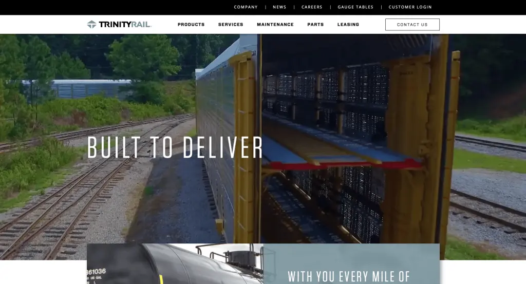
TrinityRail aspires to establish a connection with users as soon as they land on the page. In order to achieve that, the site features an enticing movie that showcases the company's offerings. You will see a brief textual piece that explores the company's operations after the video.
This website has an amazing user interface (UX), as the layout makes evident. Additionally, the color palette of gray and black with sporadic orange and yellow accents enhances the website's appearance.
10. T-L Manufacturing Website Examples
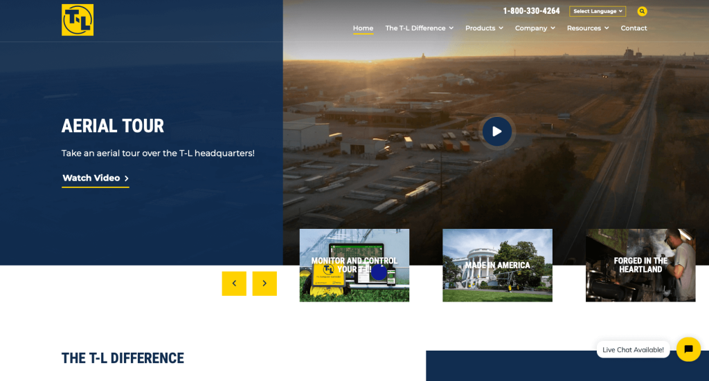
Testimonials are a very significant feature that the website emphasizes on the homepage in order to establish the proper rapport with the visitors. The "testimonials" section has a right and left arrow button that allows you to view all of the reviews that customers have written for T-L's goods and services.
The primary hue of the website is blue, with yellow used for highlights. Additionally, there is a dialogue box on the lower right corner of the screen that allows you to have a conversation with the T-L team.
11. Beechcraft
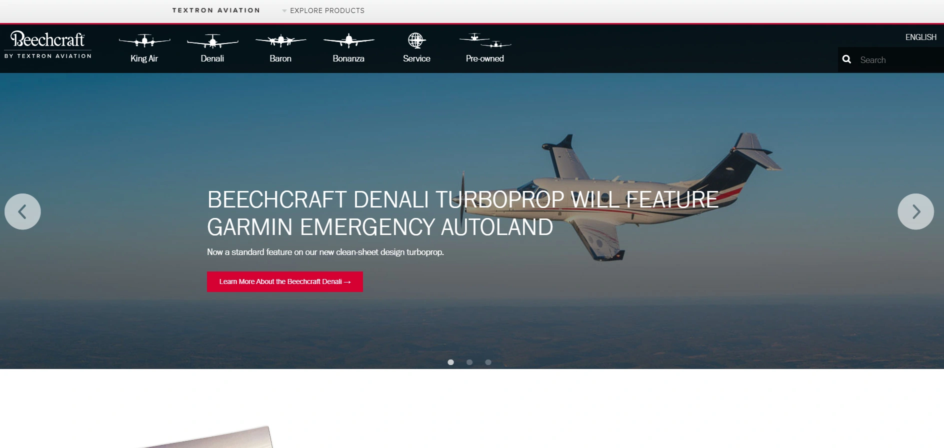
The instant they click on this website, aviation aficionados will fall in love with it. You may see eye-catching images of aircraft and the systems that go into making them right on the homepage. Also, the website features a selection of captivating videos that illustrate the company's story.
The webpage is primarily white with sporadic red accents. And that's what guarantees that the content will be the only thing on the visitors' minds. The company's Twitter handle and a few intriguing tweets can be found at the bottom of the homepage.
12. Fairlawn Tool Inc.
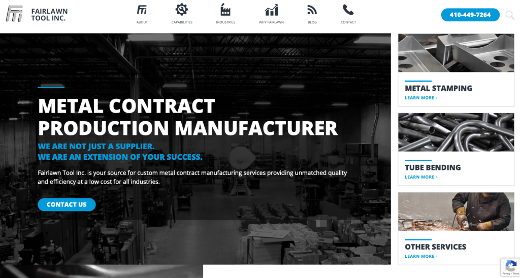
The Fairlawn Tool Inc.'s blue and gray color scheme complements the services and goods the company offers nicely. To be honest, the color blue is both incredibly calming and visually arresting. The homepage includes information about the business as well as a "contact us" link that enables you to get in touch with them directly.
You can go through the fascinating blogs located at the bottom of the page to discover more about metal and how it functions.
13. GE Manufacturing Website Examples
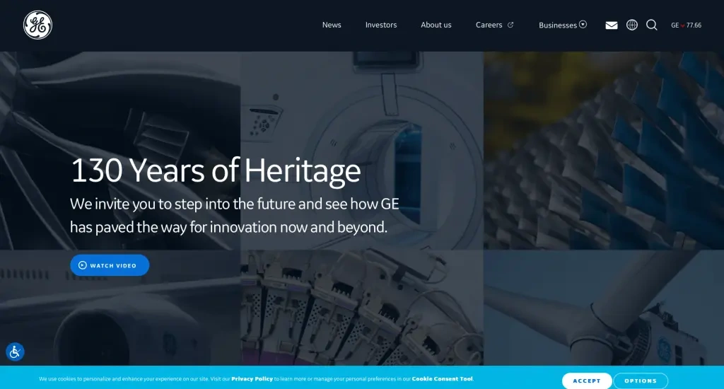
The GE manufacturing website could be the perfect place for you to get ideas if you like bold graphics and vibrant colors. The company logo, a "search" symbol, and a menu with a list of alternatives are located on the homepage's top ribbon. Additionally, you can always use the "search icon" if you're having trouble finding anything.
You only need to scroll down the homepage to learn a little bit more about the GE team.
14. Aalberts
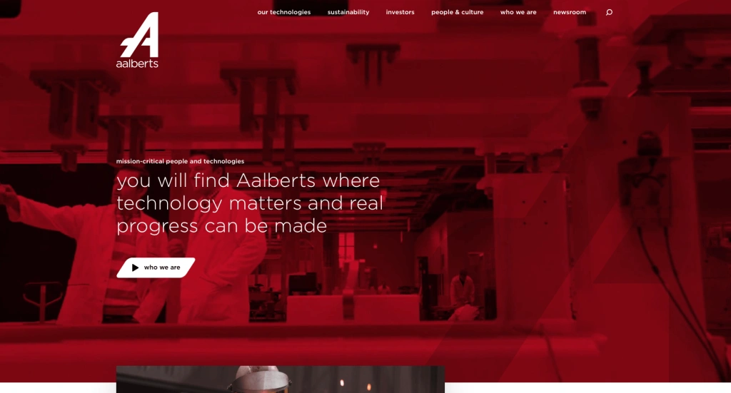
The first thing that strikes you when you visit the website is the eye-catching and visually striking video. The content is made even more captivating by the application of a crimson filter. Additional information about Aalberts's mission can be obtained from the video and click the "Who We Are" link.
Scrolling down will also reveal job openings, new reports, and interesting case studies. Additionally, by selecting the "take a tour option," you may see how the business is contributing to a sustainable environment.
15. Glauber Manufacturing Website Examples
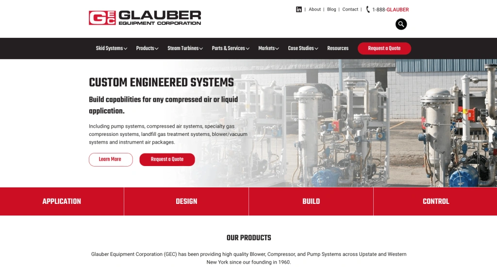
Glauber's website will attract each user with its uniqueness. The website of Glauber has a bright and striking look with its red-and-white color scheme. To make it easy for you to navigate and discover what you're looking for, the website's design has also been carefully examined.
Right at the top of the homepage is a "request a quote" button that you can use to acquire an estimate of the cost of the service that Glauber offers.
16. Sonoco
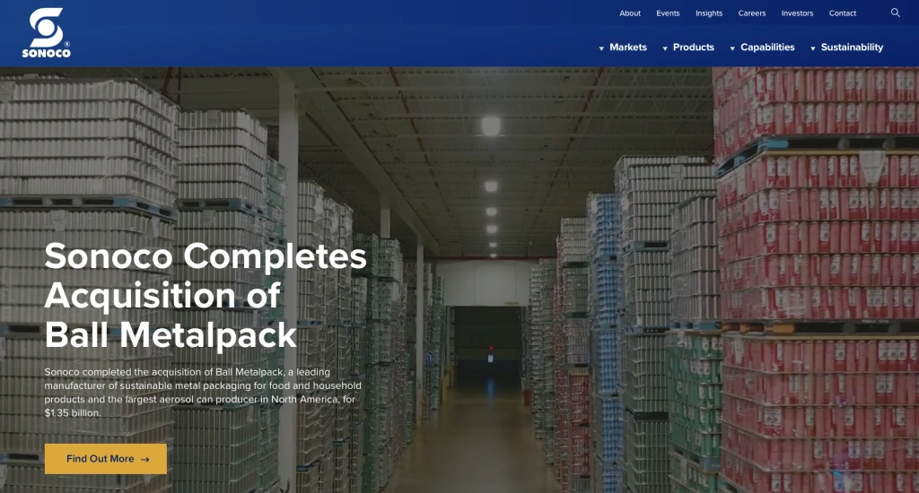
The videos and the "sustainability story" part on the main page are the first two things that will entice visitors to the website and compel them to stay for a long period. For the most part, Sonoco's website layout employs a blue-and-white color pattern. However, the designers used yellow to draw attention to certain features and aspects.
Go to the bottom of the page and select the "Let's Talk Solutions" tab if you're seeking the services the organization offers. Furthermore, the website's ability to link to every other website owned by the corporation is extremely outstanding.
17. Markforged
This webpage on additive manufacturing does a great job of outlining the value proposition for the client: "Our smart platform makes it easy to solve tough manufacturing problems." Together with application spotlights, case studies, blogs, supporting data sheets, and technical resources, the website's stunning 3D graphics and engaging content demonstrate how they address the problems of their clients. In order to help visitors better picture, they provide a helpful learning library that makes it easy to understand the fundamentals of 3D printing.
18. Plexus Corp.
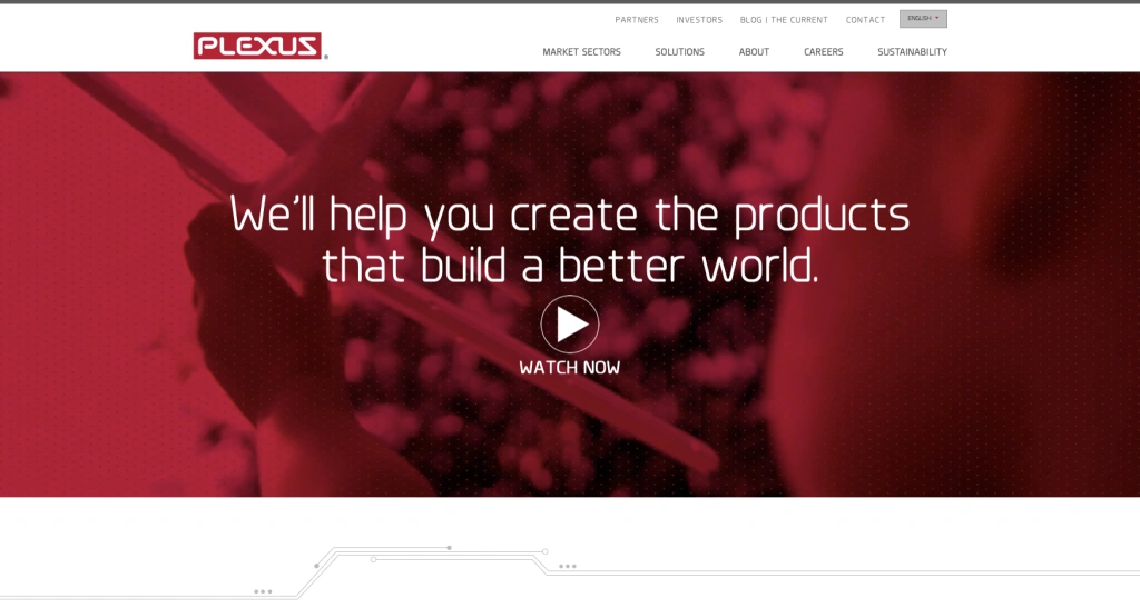
The Plexus Corp website is amazing in every sense of the word. The website welcomes visitors with a pleasing red landing page. As demonstrated in an introductory video on the website, Plexus is also helping to create a better society.
The website offers all the information a visitor may want, starting with corporate reports for employment openings. You may see a world map with red pins showing all the locations the company has operations in if you continue to scroll down.
19. Pierce Manufacturing
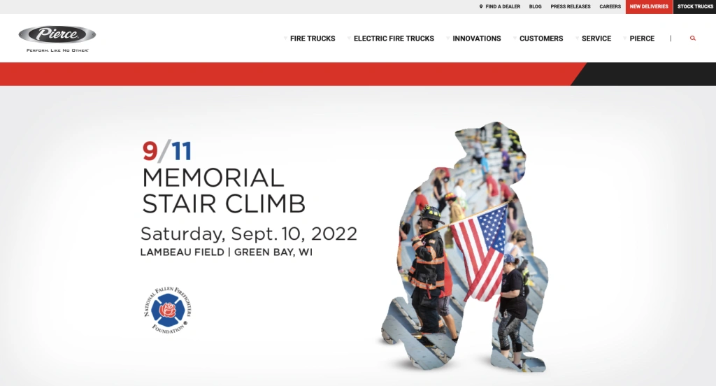
The website's striking color scheme is among the first things you'll notice when you visit. The moment viewers click on the website link, the mix of black and red manages to grab their attention. As a result, visitors to the website stay on it longer on average and are more likely to use the services provided.
The website of Pierce Manufacturing gives users adequate opportunity to comprehend the brand's mission by listing all of the most recent blogs linked to the service it offers. Additionally, the social media handles for the brand are all emphasized at the bottom of the main page.
20. Lincoln Electric
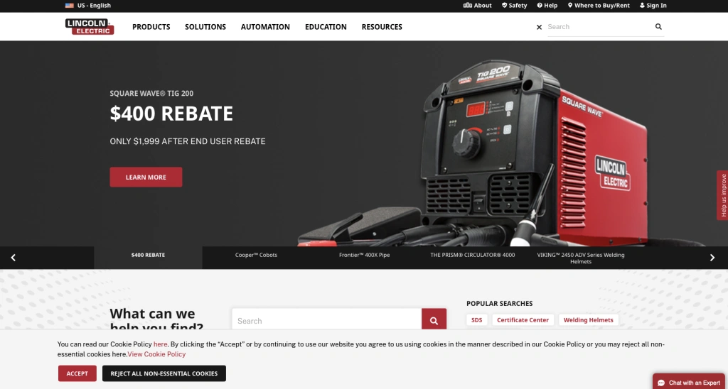
Convenience for users is a top priority in the design of this website. When you initially arrive on the webpage, the "What can we help you find" option will be the first thing to grab your attention. You won't have any trouble finding the search bar and obtaining the information you're looking for.
The menu can be found on the website in the upper left corner. Additionally, you will have instant access to a wealth of educational tools and content with just one click that could be very helpful to you.
21. Evolution Manufacturing
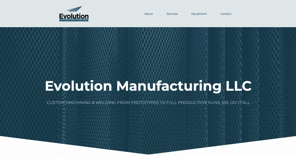
The layout and style of this website are meant to grab your interest. The majority of guests find the striking teal and white combo to be quite appealing. When you first visit the website, a thorough "About Evolution Manufacturing" section will introduce you to the company. Details on the services the business offers come next.
Notable is the way the designer made it simple for users to find the store by including a map at the bottom of the page. You may also send messages to the company via the contact form on the website.
22. Proto-1 Manufacturing
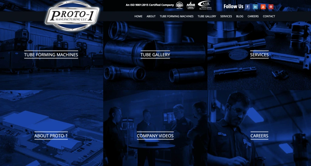
Undoubtedly, Proto-1 Manufacturing has done a fantastic job when it comes to manufacturing website design. The website efficiently expresses the brand's services through a well-balanced combination of written information and visuals. Important details regarding the businesses the brand has collaborated with are available.
Additionally, all of the company's social media accounts, including LinkedIn, Facebook, YouTube, and Pinterest, are linked at the top of the main website. If you would want to read blogs, you can locate them by going to the menu ribbon.
23. Encapsys
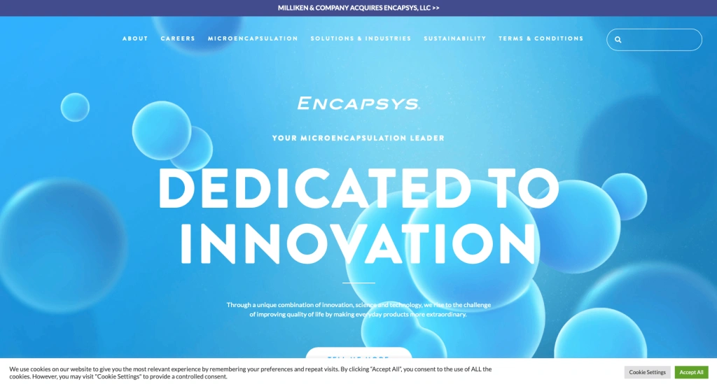
As the name implies, the website's astounding simplicity captures the attention of users. There is a "tell me more" link on the webpage that will assist you in finding out more about the offerings of the business.
When you select the "about" option, a comprehensive history of the brand's accomplishments is shown for visitors to peruse. Additionally, you'll want to remain a little longer and go over the offerings because of the website's designers' relaxing blue color scheme.
24. Go Fast Manufacturing
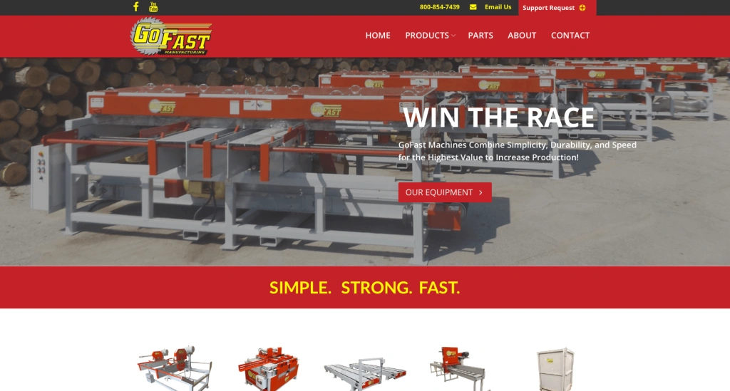
Yellow and red are two of the most popular color combinations on the market, and they are used on the Go Fast Manufacturing website. The website's color scheme, combined with big letters, makes it incredibly simple for users to read the content.
Additionally, if you scroll down a little, you will see a place where you must enter all of your information in order for the business to send you a complete brochure. Additionally, there is a red-highlighted "Support Request" section at the top of the homepage.
25. Sharretts Plating
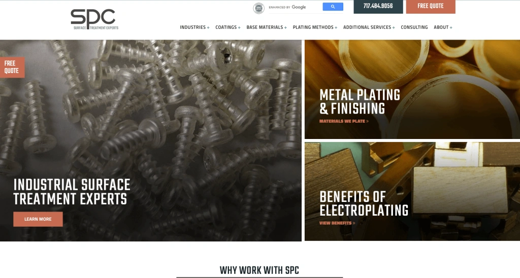
The primary methods used on this website to grab users' attention are vivid colors and tones. And they do admirably in it. Because the images are so vivid, the designer went with a white background to create a minimalist look. As a result, both the text and the photos stand out well and are quite simple to read.
The webpage has a "free quote" tab in a box with a rust color in the upper right corner. Additionally, if you would like to subscribe to the company's newsletter, enter your email address at the bottom of the page.
26. Plex Smart Manufacturing
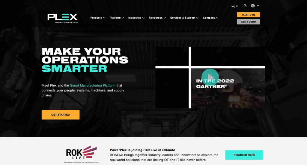
When you visit our website, innovation is going to be the first word that comes to mind. The website designer has cleverly employed a black background along with appropriate design components to draw in visitors. A search icon located in the upper right corner of the homepage might help you find what you're looking for quickly.
You'll also note that all of the businesses' significant clients are highlighted and properly listed if you scroll down a little. In case you have any questions, there is a chat feature on the website.
27. Rockwell Automation
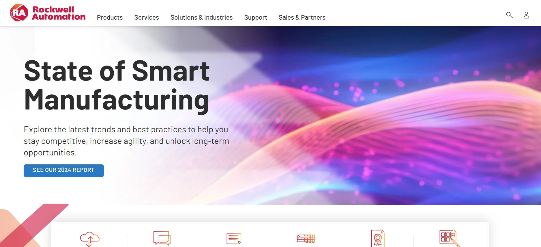
This website utilizes white space effectively and is straightforward and well-structured. Because of the thoughtful arrangement and the use of white space, visitors are not overloaded with information. Everything is in its proper position, so you won't have any trouble finding what you're looking for.
You may provide the company with valuable feedback by selecting the "feedback" option located on the right-hand side of the website.
28. John Deere
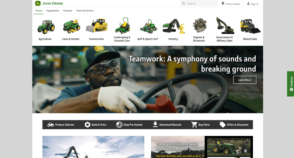
Visitors to John Deere's website won't have to wonder what to expect because of the way it is built. You will be presented with all of the services that the organization offers as soon as you enter the website. Additionally, you can "shop pre-owned section" if you support ethical and sustainable shopping.
To be honest, the white and green color scheme complements the agricultural equipment services that the business provides nicely. You can buy John Deere products by clicking the "shop now" option located towards the bottom of the page.
29. Weima
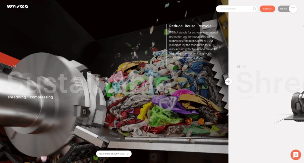
As soon as you visit this Weima website, you will be drawn in. The home page's attractive combination of colors, animation, and photos will catch your attention right away. Furthermore, you may view all of the company's activities by using the little "swipe" option on the right side of the display.
The options for "contact" and "menu" are located next to each other in the upper right corner of the screen. You can also view the press coverage near the bottom of the page.
30. Independent Machine Company (IMC)
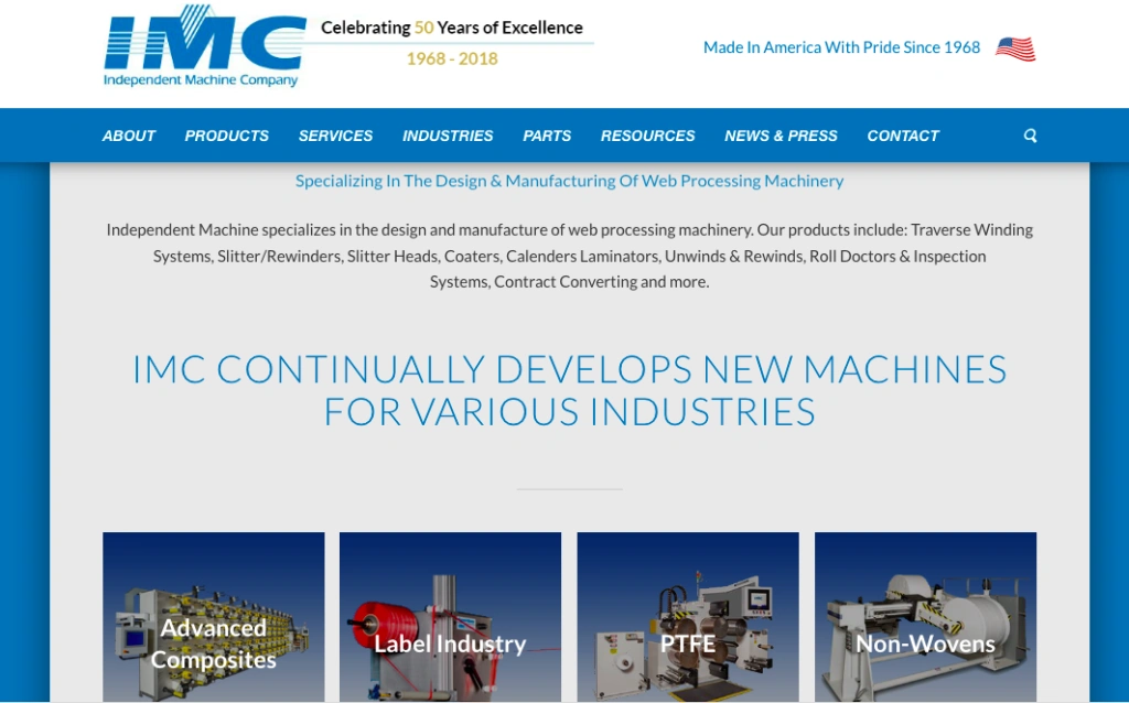
Another manufacturing website that does a good job of summarizing what it has to offer is this one, which reads, "Specializing in the Design & Manufacturing of Web Processing Machinery." The webpage doesn't make you go below the fold to find relevant machinery for your particular industry—it emphasizes their main offerings right after the hero image.
Unlike most other industrial websites, this one allows you to compute the spool length for a particular spool size or the spool size for a specified length of material, thanks to its interactive spool calculators.
31. Marion Body Works
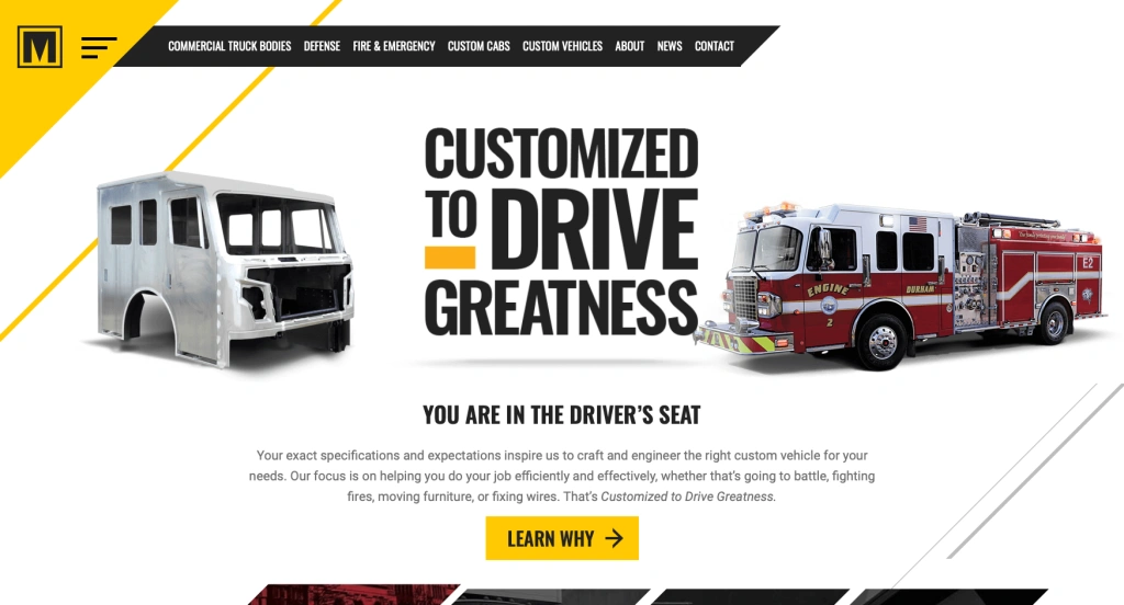
With a striking color combination of black and yellow, Marion Body Works' website effectively conveys the services they offer. Several pictures of the company's customized cars may be found at the top of the page. Thus, the visitor is given a preview of what to expect right from the start.
Because every component is thoughtfully designed and arranged, users may navigate the website with ease. Additionally, the website has a part where you can quickly get a free guide with checklists and maintenance advice. And just go to the bottom of the page to connect on social media.
32. AngloAmerican
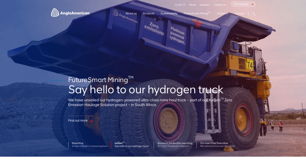
AngloAmerican's website is visually striking due to its usage of purple and orange hues in addition to white. The text is easy to read because of the bold typeface and clear spacing. The website has just the right amount of white space to highlight the written and graphic information.
Links to the several company websites of every country in which it conducts business are included on the website. To see which nations the company serves, scroll to the bottom of the page. You can also click on the "red envelope" icon at the bottom of the page to view the most recent updates.
33. CST Tires
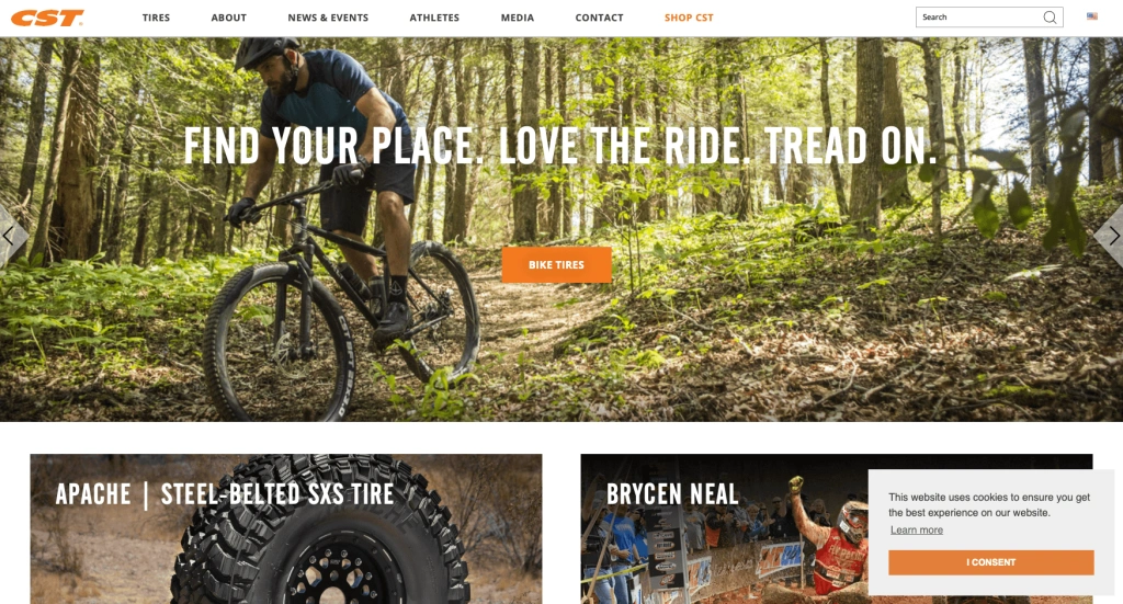
There is more visual stuff than text on the website's main page. Because photos manage to capture more attention than any other element, this makes the outlook more engaging and attractive. Each of these pictures has a link to the brand's accomplishments and related products. All of the brand's essential information may be found by navigating to the upper left corner of the homepage. If you'd like, you can go straight to the "shop" tab and start shopping.
34. Caterpillar
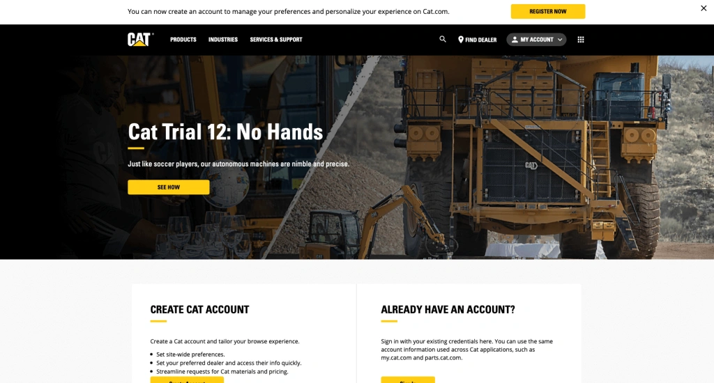
The basic colors used on the Caterpillar website are yellow and black. Nonetheless, the backdrop color is kept white to draw attention to the portions. Additionally, there is plenty of white space to prevent any of the textual or visual information from appearing cluttered. Additionally, the option to "register now" appears when you move your cursor to the upper right corner of the screen. If you would want a customized online experience, click on it. You can also get professional guidance and business insights by visiting the "CAT blog" option found on the homepage.
35. Markforged
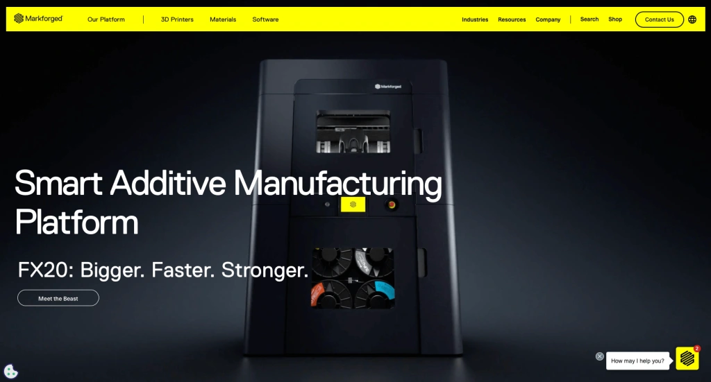
If you're looking for something bold, precise, and striking for your website, Markforged is the ideal source of inspiration! Black and yellow are used throughout the Markford website to create an eye-catching, professional vibe. Additionally, the fonts were kept large and designed in white by the designers to quickly capture the visitor's attention to the textual content. The "How may I help you?" link is quite intriguing; it shows up regardless of how far down the homepage you scroll.
36. MAC Instruments
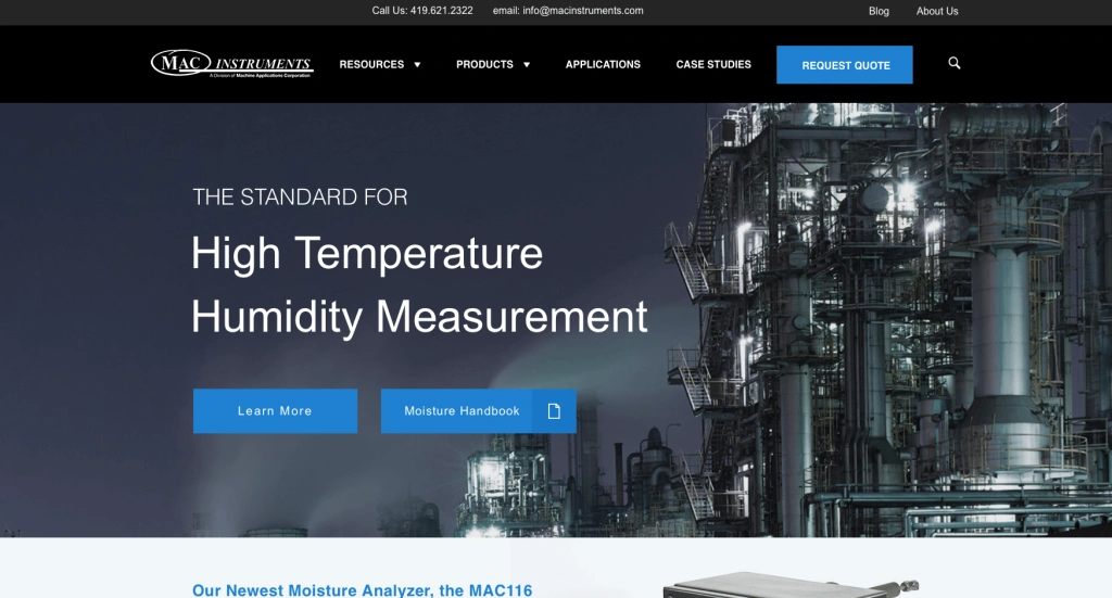
MAC Instruments has an amazing and well-designed website. The backdrop colors of the website are a mix of white, gray, and black. Additionally, the designers have very cleverly selected a lovely shade of pastel blue for the highlights, to really bring the selections to life. Every one of the major products is clearly laid out on the home page. Easy access to the address, phone number, and email address is provided to visitors by placing them at the top and bottom of the page, respectively.
37. Anduril
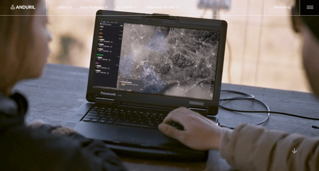
The moment you land on Anduril's website, a compelling movie summarizing the company's goals will play. You'll see that the layout is clear and simple when you navigate around the page. You only need to click the "learn more" button to go more into any one topic; all the details are displayed one after the other. Bright and captivating photos adorn the entire webpage, telling the brand's narrative in a way that nothing else can. The contact details are located at the bottom of the page as well.
38. DuPont
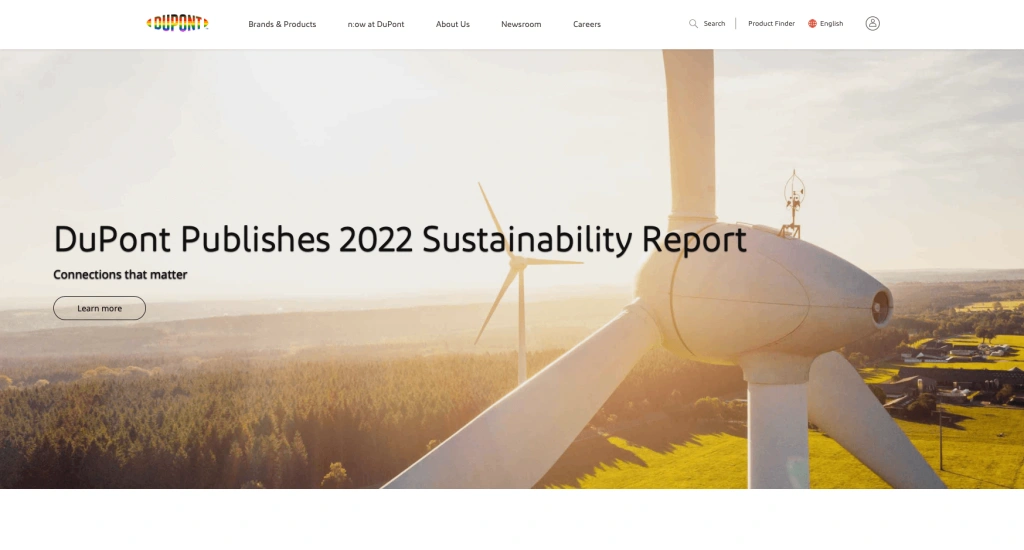
Dupont has mastered the art of developing a superior manufacturing website. To make sure that all the other parts stand out, the website's background is still white. The landing page of Dupont is a great combination of relevant images and text that gives more details about the products and services the business offers. All of the company's published news articles and links to Dupont's social media accounts can be found near the bottom of the page.
39. Molecular Products
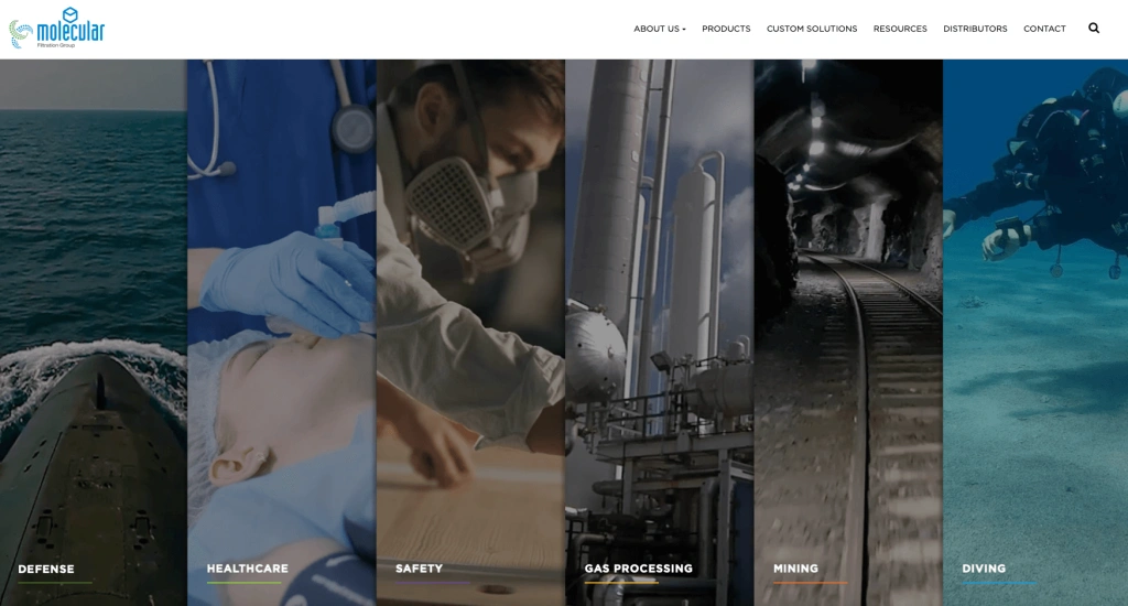
Molecular Products' website is spot on in every way and provides them with all the information they need. When you first visit the webpage, you'll see that every area of the business services is organized and listed clearly. To discover more details about the services, click the "find out more" link located in each section. Even the company's products and other resources are accessible by hovering over the upper right corner of the screen.
40. Tungco
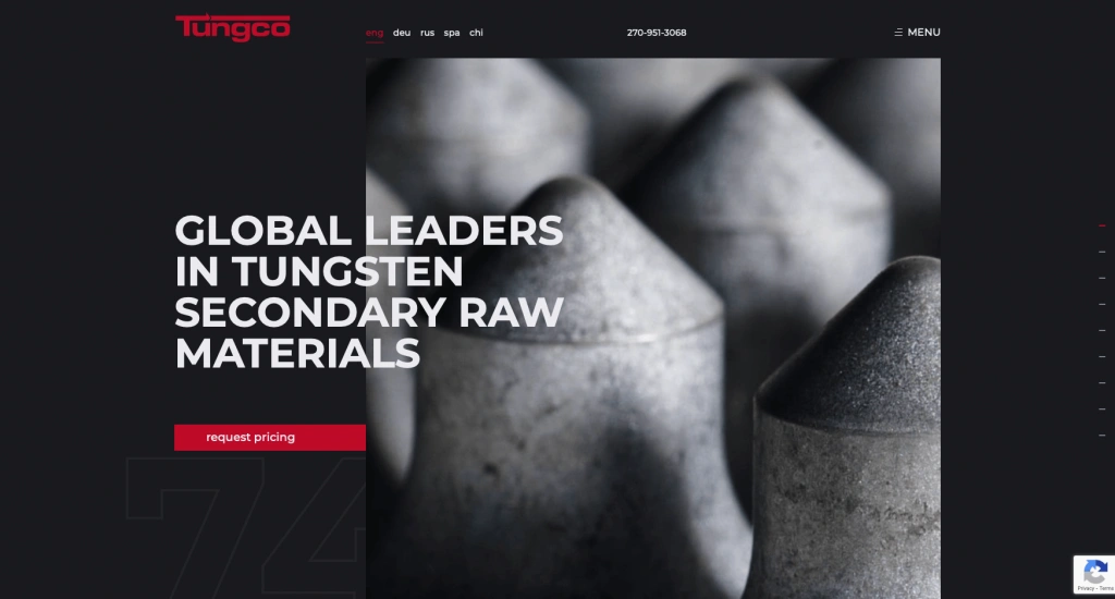
One of the best color schemes is used on the Tungco website, which improves its aesthetic appeal. The striking combination of black and red draws the observer in and makes a statement. To be honest, the textual and visual material jump out because of the color scheme and the prominent white typography. As soon as you land on the webpage, you may check out the company's two main services by clicking on "shop" and "sell." Additionally, you can get information about what sets this business unique from its rivals by scrolling down the homepage.
41. TexTech Industries
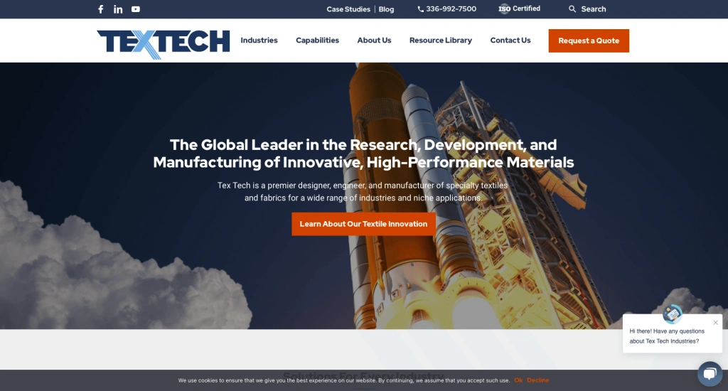
The TexTech Industries website will catch your eye as soon as you land on it because of its eye-catching, vibrant images and strong writing. It's important to notice that by positioning the logo in the center of the webpage's top bar, the designer gave it just the appropriate amount of attention. It's interesting to note that the website's "call" and "search" icons are all carefully positioned on the top ribbon. Everything you require is right there on the ribbon.
42. Titan Systems
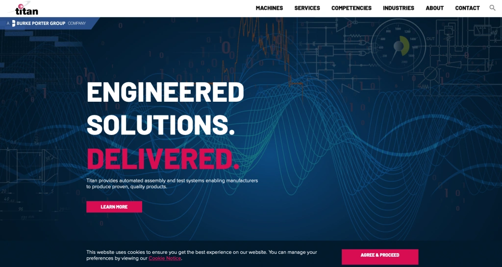
If you like looking at classic websites, you will definitely like this one. White serves as the backdrop hue, and Titan Systems employs blue and dark pink for the highlights. You won't have any eye strain from the website's perfectly spaced elements. You'll find clearly separated sections that shed information on the areas in which the business operates as you scroll down.
43. Lockheed Martin
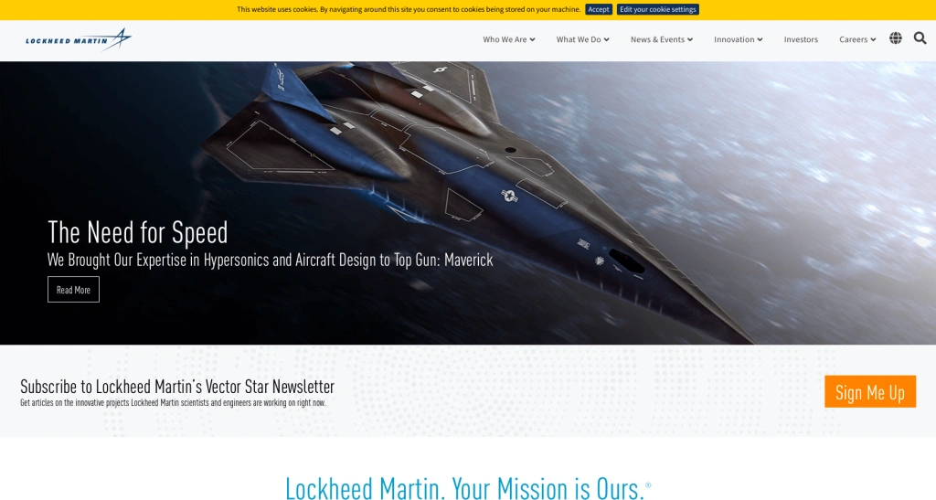
As soon as you land on the Lockheed Martin website, a colorful picture of a spacecraft will greet you. And that conveys a positive impression of what the business does. This aerospace and international security company's website features a visually appealing blue-and-white combo. There are also sporadic orange touches for the highlights. You can choose the "sign up now" option to receive frequent information about Lockheed Martin's most recent advancements.
44. Ihne & Tesch
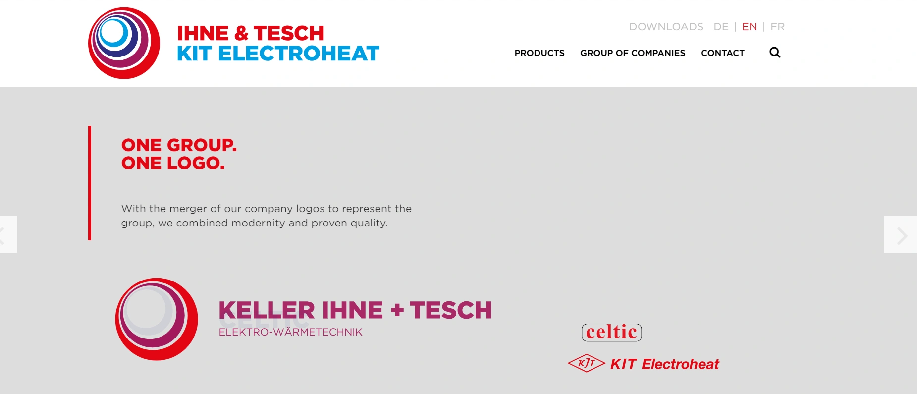
The website for Ihne and Tesch is the last entry. The three primary colors on the website are red, blue, and white. All of the services offered by the business are listed in the first main area of the homepage, and you can scroll through them all to see them all. As you approach the page's finish, you'll see that every region in which the business conducts business is listed in an orderly and tidy manner. A globe map with colored pins placed on the locations where the business operates is also available.
45. ZEON Chemicals
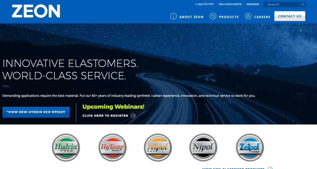
ZEON's visually appealing and simplistic design drew users in and distinguished the brand as a leader in the industry. With benefit-oriented language that encourages visitors to take action (View Our Products, Talk to an Expert, Join Our Team, etc.), the homepage avoids the interminable scroll that befalls many websites. Both desktop and mobile users will find the site design to be fast-loaded, easily navigable, and conducive to finding product information. Every product landing page has a wealth of technical and visual information, including data sheets, video demos, and application-specific features and benefits, that engineers frequently look for when screening suppliers for their procurement teams.
46. Mattei
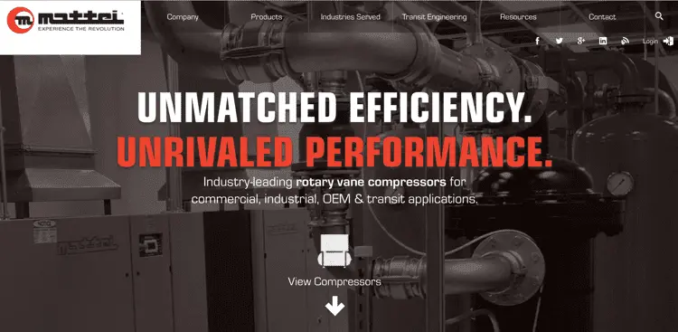
You only have approximately seven seconds to capture a visitor's interest before they leave your manufacturing site. Considering this, Mattei, which produces the world's largest number of vane compressors excels at grabbing your interest. The initial thing you'll observe is that the homepage contains basic but impactful animations for the homepage text, images, and menu bar.
The use of language along with the dual-toned headers creates a bold, attention-grabbing, and authoritative image. Showing pictures of Mattei items helps customers easily see what the company sells. Mattei's website contains SEO-optimized content that offers extensive information on their skills and sectors.
47. Protolabs
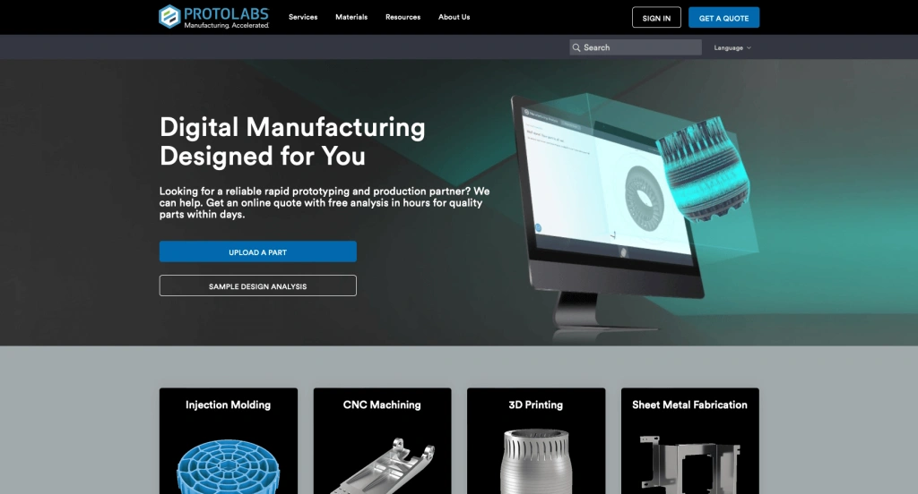
The website explains what Protolabs is all about right away! A part that explores the company's operations may be found beneath the top ribbon. Every service offered by the business is clearly laid out, and all you have to do to get more information about a specific service is click on the "learn more" button. A new feature of the website has been added where you may seek assistance with your 3D printing project. Additionally, a section outlining the company's operations may be found towards the latter half of the homepage.
48. Xometry
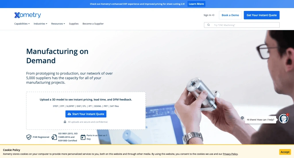
The homepage of Xometry's website, which is primarily white, has highlights in a stunning blue color. The typeface is used in a variety of sizes to highlight the text on the page. Every service that Xometry offers is arranged in a row, and each listing has a "learn more" option to the right of it. You can also obtain quick responses to your inquiries by using the chat box at the bottom right of the screen.
49. Stora Enso
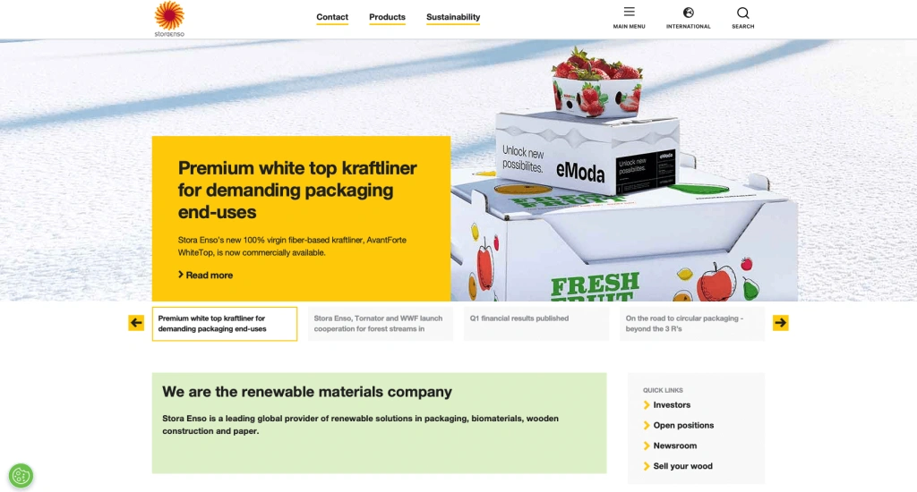
Stora Enso's commitment to environmentally friendly packaging solutions is clearly communicated on its website through the usage of visual elements. When you first visit the homepage, you'll be greeted with a plethora of colorful and dynamic images that are directly related to the business's sustainability initiatives. Additionally, there are left and right arrows to make it simple for you to browse among the pictures. Additionally, the organization offers a number of sustainable alternatives if you scroll to the bottom of the page.
50. UVify
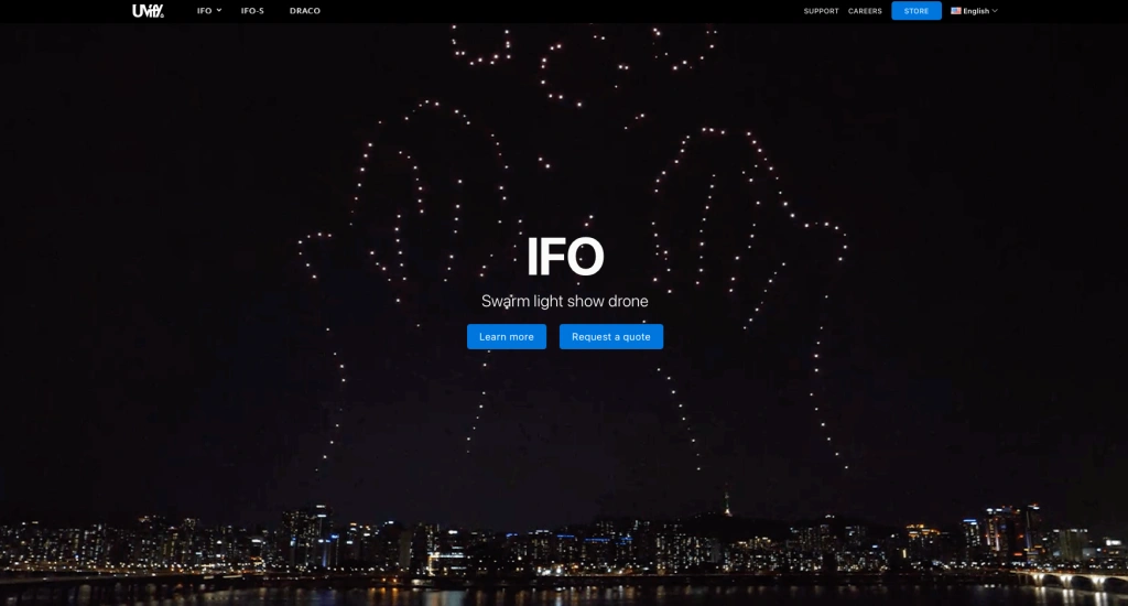
A cool video showing an amazing drone performance in the night sky can be found on the website of Uvify, a warm light display drone company. The color blue is employed as a highlight throughout the black-and-white design of the website. A pop-up box shows after navigating the website for a few minutes. To sign up for UVify's newsletter, enter your email address here. You will also be prompted to rate your experience with the website when you reach the bottom of the page.
51. Lear
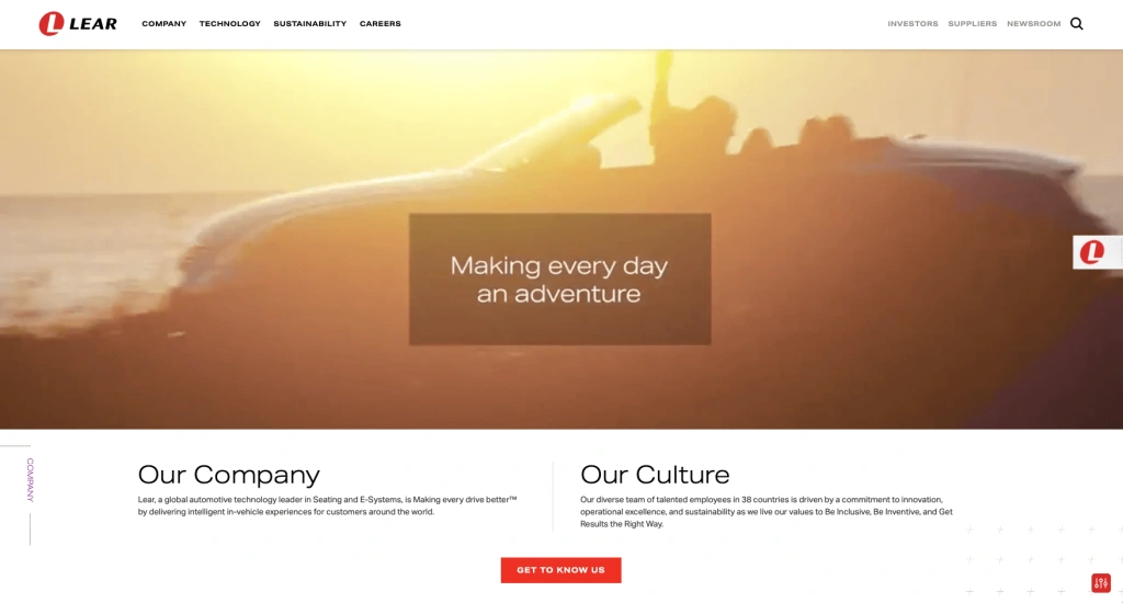
The company's objective is appropriately represented on Lear's website. Even the website's video, which gives you a quick rundown of the business's goals, makes this clear. By selecting the "Settings" icon in the lower right corner of the screen, you can alter your experience on the website. The website of Lear offers alternatives to make it easier for users with ADHD, vision problems, or cognitive impairments to navigate.
Let’s See How They Generate Maximum Revenue: Case Study
As we have seen the best 51 manufacturers' websites, now let’s see some real case studies that show how these manufacturers are making maximum revenue through their websites. Even though there are several manufacturers that generate plenty of leads through websites, we will see the case of three manufacturers.
1. 3M
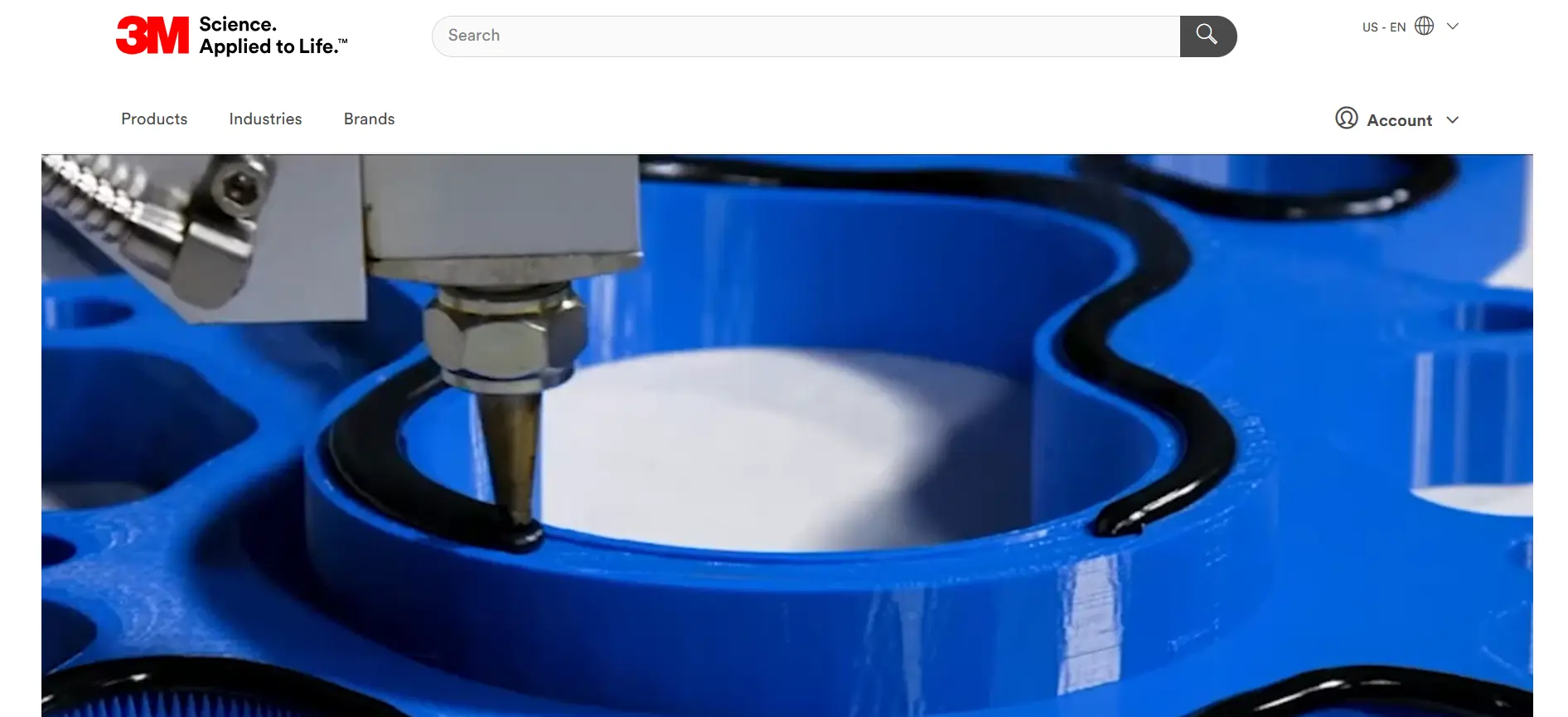
3M is a top manufacturer offering products across industries like healthcare, automotive, and construction. Operating in over 70 countries and with a presence in 200 markets, 3M’s website is one of their major marketing tools.
Do you know? The 3M Company estimates that people will visit 3m.com, their official website in December 2024 and almost 3.3 million in September 2024. ( source ). Just think, if they have 2 million + website visitors per month, then what will be the revenue generation through that? It is a fact that, when there are more website visitors, there is more chance of lead generation and conversion.
The business website of leading manufacturer 3M is a fine example for manufacturers who are seeking manufacturing website designs. With a white and red theme, 3M’s website offers a simple user experience while incorporating several useful features to engage and retain users.
- Features for conversion: They have added several features that are very useful for easy conversion such as CTA, contact forms, chat options, and many more.
- Special design for manufacturing: The website has special sections for different industries, like hospitals, energy, and factories, to show how 3M can help them.
- Easy Product Finder: A smart tool on the website helps people find the right product quickly from over 60,000 options.
- Educational Content: The website has helpful articles, stories, and guides to explain how 3M’s products work. These products helped the company make $32.7 billion in 2023. ( source )
- Videos: They have added videos that show their products and expertise on the landing page itself.
- Sustainability Hub: Showcases their goal to achieve carbon neutrality by 2050 and reduce water usage by 25% by 2030.
2. Honeywell
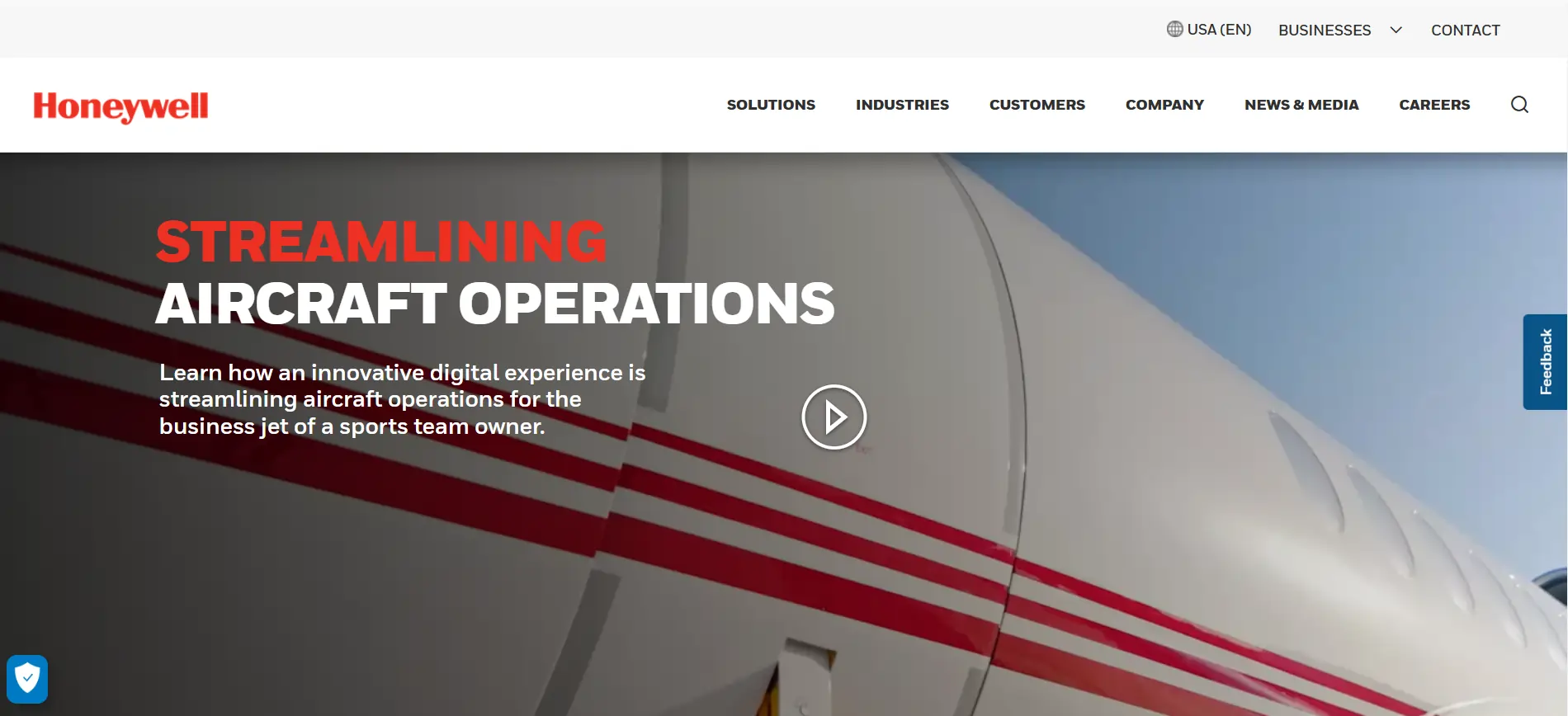
As an international leader in aerospace, building technologies, and safety solutions, Honeywell has built a strong brand image. With 3.4 million visitors in December 2024, Honeywell’s website stands out as a clean and easy-to-use manufacturer website. (Source )
At the same time, we can notice that their website is own of the best examples of improvement and upgradation. They are continually improving their website rank by working steadily on it. In the past month, 44.48% of desktop visitors to honeywell.com came from direct traffic, with organic search coming in second with 38.43% of traffic. ( Source )
Even though there are many manufacturer websites to consider, Honeywell’s manufacturing website design is improved in all terms. It proves that how feature-rich may be your website, you need to improve it day by day. When we go through the content of their manufacturing website, we can see how clearly they are communicating with visitors.
- Personalized Content: The website has special sections for different things, like airplanes, buildings, and hospitals.
- Space for Trends: There’s a space on the website to show what’s new and popular, which is fun and helpful to read.
- Smart Tools: Handy tools like calculators and planners make work easier and save people money.
- Rich Media: The website has fun videos, pictures, and demos that show how their products work.
- Feedback Feature: The feedback feature is highlighted on this website, which makes users more connected to their company.
- Customer Portal: A super easy online place where customers can find important papers, learn new things, and get help with the 40,000+ products they sell.
3. John Deere
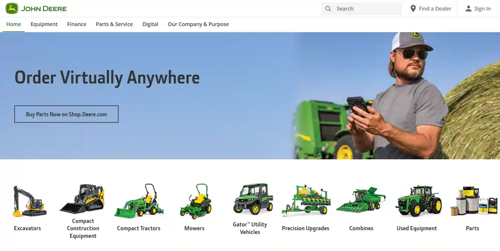
With 187 years of experience, John Deere company operates in 30+ countries and generated $61 billion in revenue (2023). ( Source ) John Deere focuses on creating agricultural, construction, and forestry machinery. Do you know? John Deere’s manufacturing website had more than 1 million website visitors in November 2024.
Referrals rank second with 43.65% of traffic to Johndeere.com, while direct traffic accounted for 50.01% of desktop visitors last month. Paid Search is the most underutilized medium. With 70%+ website traffic coming from the USA, we can see how they have succeeded in attracting users from where they targeted( Source )
The user-friendly interface, customer-focused tools, and focus on assisting farmers and contractors in maximizing efficiency make the John Deere website stand out. Their skillful fusion of technology and narrative guarantees a captivating user experience. The following features of their website attract more users and help them in revenue generation.
- Interactive Product Catalog: You can look through lots of equipment, see pictures, watch videos, and read about how they work. There are over 300 types of products, making it easy for farmers and workers to find what they need.
- Build & Price Tool: You can design your own machine, choose what you want on it, and get an idea of how much it will cost right away. It’s faster and more fun than asking in the old way!
- Dealer Locator: This tool shows you where to find any of their 2,000 stores around the world for support and service.
- Customer Support Hub: A special place where you can find product guides, solve problems, and get help. Over 100,000 people use it every month!
- Sustainability Stories: They share how they’re helping the planet, like cutting harmful gases by 30% by 2030 and using cool farming tools like precision machines to grow crops smarter.
Conclusion
A manufacturing company’s digital presence can be greatly improved by a well-designed website, which facilitates communication and engagement with a worldwide audience. Examples of successful tactics are given, ranging from emphasizing essential services and client endorsements to employing eye-catching graphics and intuitive user interfaces. The manufacturing websites emphasize the importance of clear communication, deliberate element, and color choices, and the integration of interactive elements to provide an engaging user experience.
FAQs
Q1: What makes a manufacturing website effective?
A: A manufacturing website is effective when it clearly communicates the company’s products and services, is easy to navigate, and provides valuable resources such as technical data, case studies, and contact information. It should also have a professional design that reflects the brand’s image.
Q2: What elements should be included on a manufacturing website design?
A: Major components of a website for manufacturing consist of:
- Clear product and service descriptions
- Technical resources and datasheets
- Case studies and client testimonials
- Contact information and support options
- E-commerce capabilities
- Company background and mission
- News and blog sections for updates
Q3: How do I make my manufacturing website design stand out?
A: To make your manufacturing website design stand out:
- Use top-quality images and videos to describe your products
- Ensure the website is mobile-friendly and fast-loading
- Implement a clean and professional design
- Use compelling and clear calls-to-action (CTAs)
- Highlight unique selling points and industry expertise
- Provide easy access for technical documents and resources
Q4: What are some common mistakes to avoid when designing a manufacturing website?
A: Common mistakes to avoid while manufacturing website design include:
- Overloading the site with too much information
- Using poor-quality images and videos
- Having a confusing or cluttered layout
- Neglecting mobile optimization
- Ignoring SEO best practices
HIRE A TOP SOFTWARE DEVELOPMENT COMPANY

I am Manish Kumawat, co-founder of Fulminous Software, a top leading customized software design and development company with a global presence in the USA, Australia, UK, and Europe. Over the last 10+ years, I am designing and developing web applications, e-commerce online stores, and software solutions custom tailored according to business industries needs. Being an experienced entrepreneur and research professional my main vision is to enlighten business owners, and worldwide audiences to provide in-depth IT sector knowledge with latest IT trends to grow businesses online.


Partner with Top-Notch Web Application Development Company!
Discuss your Custom Application Requirements on info@fulminoussoftware.com or call us on +1-903 488 7170.
15 Days Risk-Free Trial